Jason Polkovitz
Graphic Design & Art Direction
Category: Uncategorized
-
As part of consulting on the redesign of the Art of Problem Solving’s USA Mathematical Talent Search website, I embarked on a redesign of their logo. The first three designs are completely original and the fourth is a redesign of the existing logo, substituting the serif typeface for a sans-serif one to create a more…
-
I designed a set of wayfinding signage concepts for MoMath’s new facility at 19th Street and Sixth Avenue. Although the space ultimately opened without using these designs, the project was an engaging exploration of spatial communication, and I’ve included the work here as part of my portfolio.
-
Over the years I was graphic designer at the National Museum of Mathematics one of the recurring projects I worked on was the creation of promotional and informational graphics of for the museum’s art gallery: Composite. Below are a handful of the promotional sign graphics from a select group of shows.
-
For years, I’ve been contracted by The Art of Problem Solving to create the t-shirt designs that the participants of a mathematical competition receive. It’s a fun creative exercise to do something different with each successive year. The illustrations in the 2025 t-shirt were created by my brother, Cary Polkovitz.
-

A promotional piece for an interactive talk at MoMath.
-
In 2023 a new tessellating tile was discovered that opened the door to several others that disproved long-standing geometry theories about tiling patterns. “The Hat” was the first of at least three new tiles that created aperiodic patterns (non-repeating). In celebration of this, MoMath and the UK Maths Trust ran a celebration and contest to…
-

The Museum hosted a debate around a year ago highlighting the pros and cons regarding the current state of high school level mathematical education in the United States. I was asked to create a backdrop (which also acted as an advertisement on the Museum website).
-

Unfortunately this project – a promotional brochure for a furniture restorer – died in the making… which is a real shame. I loved how it was coming along, and I respected the heck out of Marco and his amazing craftsmanship. The shop in Queens was a wonderland of tools and in-progress work. Marco is still…
-

MoMath opened a new exhibit this morning – the idea of which is to enter the parameters of a basketball shot into a ball-throwing robot and allows you to try your hand at trying to replicate the shot yourself at a basket placed next to the bot’s. A computer analyses both shots – allowing you…
-

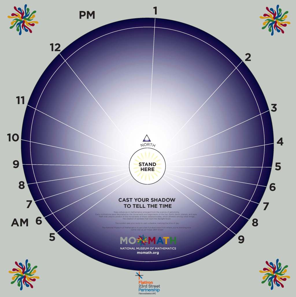
MoMath likes to celebrate the solstices with math-related events in the plaza just north of the Flatiron Building. This year I was tasked with designing a sundial (along with our Chief Educator and Associate Director as technical consultants) wherein a person would stand as the gnomon and cast a shadow telling the time of day.…