Context is key.
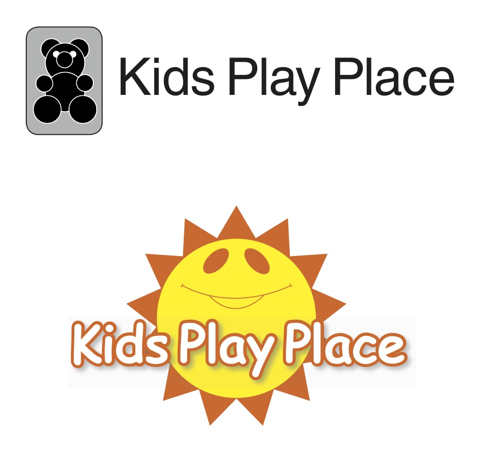
You get a lot of people who feel that Helvetica makes everything better and Comic Sans is the typeface of the devil. Here are two designs that follow different philosophies… one based on flat design and Helvetica and one based on a more dimensional design and Comic Sans. I asked my two-year old (who would be the target audience) which he liked better… guess which he chose? Everything has its place. It is vital to consider the tastes of the audience.
Whether it be typefaces, copywriting, or design style, it is all a question of context.
(Note: these weren’t done for a client… they are quick and dirty designs for illustrative purposes. Although I do like the bear).

Leave a comment