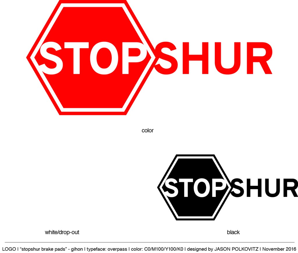
I was recently hired to create a brand name, logo, and packaging for a brake pad manufacturer who wanted to start selling their product in the United States. Below I’ve included the logo concepts, final logo, and package design.
As a side note (to explain a geometrical anomaly): the traditional octagon was replaced with a hexagon to draw the eye across to the next part of the wordmark. An octagon would, as it should, stop that movement and make the logo more clunky whereas a hexagon, with its side-corners, points to the next word. Maintaining the traditional stripe and field theme of an international stop sign (not to mention the word “stop”) keeps the message clear without hurting the flow.


Leave a comment