Jason Polkovitz
Graphic Design & Art Direction
Category: logos
-

A logo design for the National Museum of Mathematics’ junior high and high school social evenings.
-

As an on-staff graphic designer (or, rather, THE on-staff graphic designer) of a museum, the repetitive nature of the work can start to grind you down. I had seen a job offer online and decided to mess with the concept, even though I wasn’t going to get the freelance gig… you know, to keep those…
-

MoMath opened a new exhibit this morning – the idea of which is to enter the parameters of a basketball shot into a ball-throwing robot and allows you to try your hand at trying to replicate the shot yourself at a basket placed next to the bot’s. A computer analyses both shots – allowing you…
-

Summer is coming and with it the salvation of all parents who work full-time: summer camp. I was tasked with coming up with the logo for the summer program of the Museum to appear in promotional materials as well as the t-shirts the kids will get. (The final design can be found is on the…
-
The directive was to come up with a logo for what is hoped to become an annual mathematics festival for New York City. In the end, the Museum decided to go for a more generic look for the promotional material, but I was quite pleased with how these were turning out so I decided to…
-

MoMath has an upcoming games night (mostly board games with mathematical credibility) and needed a logo for web and other promotional materials. The pivot point on the Q was a play on the name of the event, with the playing piece balancing out the design.
-

Unfortunately, neither of these designs were picked by the client as he wished to go in more of a hand-drawn, Etsy-style direction (which was executed in a subsequent iteration). At any rate, I was fairly pleased with both concepts.
-
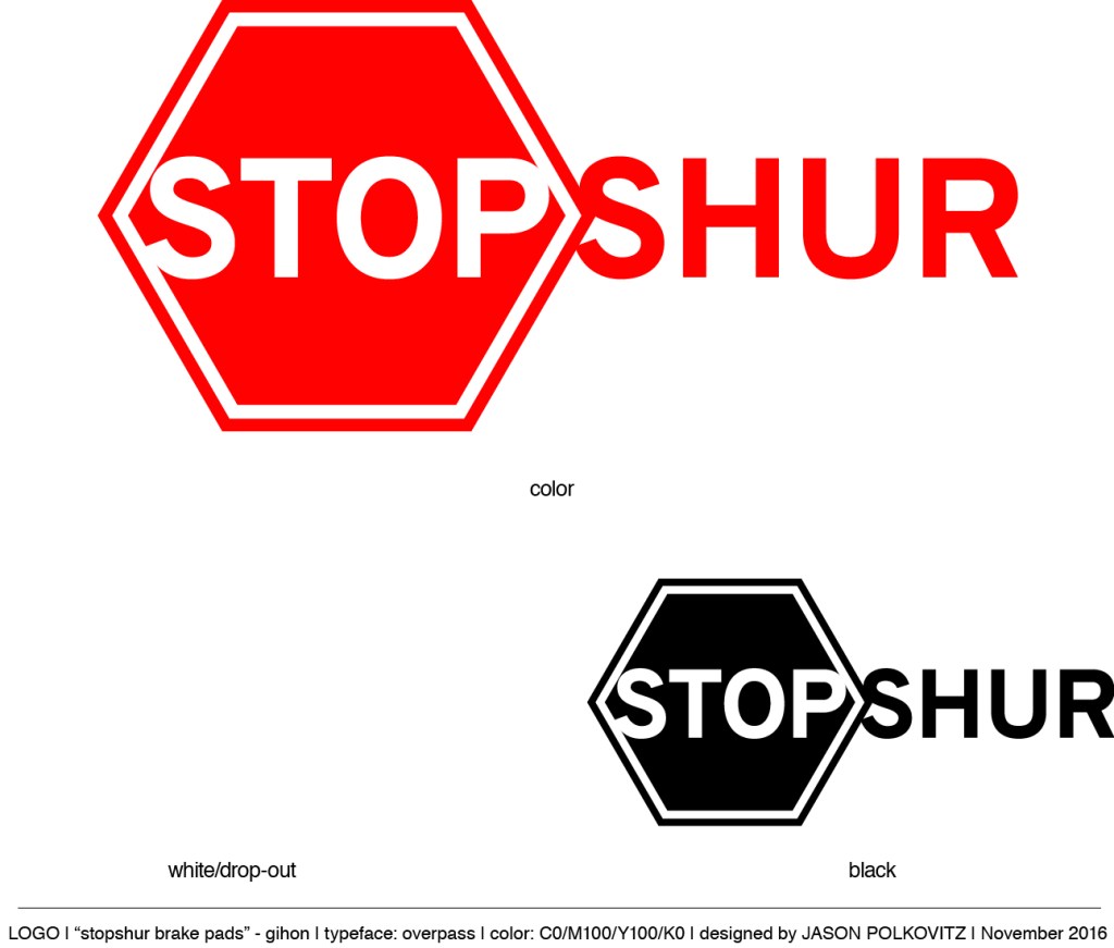
I was recently hired to create a brand name, logo, and packaging for a brake pad manufacturer who wanted to start selling their product in the United States. Below I’ve included the logo concepts, final logo, and package design. As a side note (to explain a geometrical anomaly): the traditional octagon was replaced with a…
-

Every week, the president of the National Museum of Mathematics creates two puzzles that appear in both The Wall Street Journal and the website varsity.momath.org. The task here was to create a logo for these puzzles for their title: Varsity Math. The number to the bottom right of the logo indicates which week the puzzles…
-

The designs below were created for an exhibit at the National Museum of Mathematics called “Robot Swarm,” which explores the algorithms that describe the swarming behavior of animals such as birds and insect. A video and article appearing on The Verge regarding the exhibit appears here. These were concept designs for the logo. I’d originally…
