Unfortunately, neither of these designs were picked by the client as he wished to go in more of a hand-drawn, Etsy-style direction (which was executed in a subsequent iteration). At any rate, I was fairly pleased with both concepts.
![]()
Graphic Design & Art Direction
Unfortunately, neither of these designs were picked by the client as he wished to go in more of a hand-drawn, Etsy-style direction (which was executed in a subsequent iteration). At any rate, I was fairly pleased with both concepts.
![]()
I was recently hired to create a brand name, logo, and packaging for a brake pad manufacturer who wanted to start selling their product in the United States. Below I’ve included the logo concepts, final logo, and package design.

As a side note (to explain a geometrical anomaly): the traditional octagon was replaced with a hexagon to draw the eye across to the next part of the wordmark. An octagon would, as it should, stop that movement and make the logo more clunky whereas a hexagon, with its side-corners, points to the next word. Maintaining the traditional stripe and field theme of an international stop sign (not to mention the word “stop”) keeps the message clear without hurting the flow.
Every week, the president of the National Museum of Mathematics creates two puzzles that appear in both The Wall Street Journal and the website varsity.momath.org. The task here was to create a logo for these puzzles for their title: Varsity Math. The number to the bottom right of the logo indicates which week the puzzles are related to – a later addition to the design that I’m quite pleased with. It reflects the theme and is easily changed from week-to-week.

The designs below were created for an exhibit at the National Museum of Mathematics called “Robot Swarm,” which explores the algorithms that describe the swarming behavior of animals such as birds and insect. A video and article appearing on The Verge regarding the exhibit appears here.
These were concept designs for the logo. I’d originally been going for a “Wall-E” style design, but after speaking with the Chief of Design (Exhibit Designer) and seeing the chassis for the actual robots, I decided that a concept that was more informed by that movie’s love interest “EVE” was far more appropriate.

![]()
![]()
This was produced as a sign that was hung on the draping that surrounded the build.

The schematic for the window display appearing in the Museum’s shop: Additions.

This design was used as both the signage above the exhibit, and as the banner above the digital controls – below which appears the graphics describing the five swarming behaviors available to the museum patron to interact with (the yellow dot represents the patron).


I’m kind of glad that the New Yorker published this article lambasting the new Google logo as it helped to solidify my opinion on it.
I happen to like the new logo. It does what it needs to do from a design perspective. I don’t mean aesthetic, I mean design. It needed to be clean and easy to read on mobile, which is where most people consume these days; it reflects the new Alphabet corporate feel, which the former Google corporation needs to promote; and it is less unwieldy from a rendering point-of-view, which is important as bandwidth and processing power is precious. I’m sure a lot of people find it jarring, since the Goog didn’t prepare us, but I admire that they released it this way – they got the logo onto the site, several of their apps (although it would have been great if it were in all of them), and onto their headquarters building in Mountain View. Honestly, I think more people should be discussing the upcoming Verizon change (ugh) than this. I like that they are completely embracing the idea of design – this goes so much better with the new Material Design aesthetic than the old Google “Anti-Logo” did. It bodes well for design as a whole that the company that didn’t care one whit about what a thing looks like has realized that design can make everything more useable – both engineering-wise, and pleasure-wise.
As a side note: I just want to say: using the hipster Comic Sans hatred in design commentary is the last refuge of a scoundrel. It is overused and needs to go away.
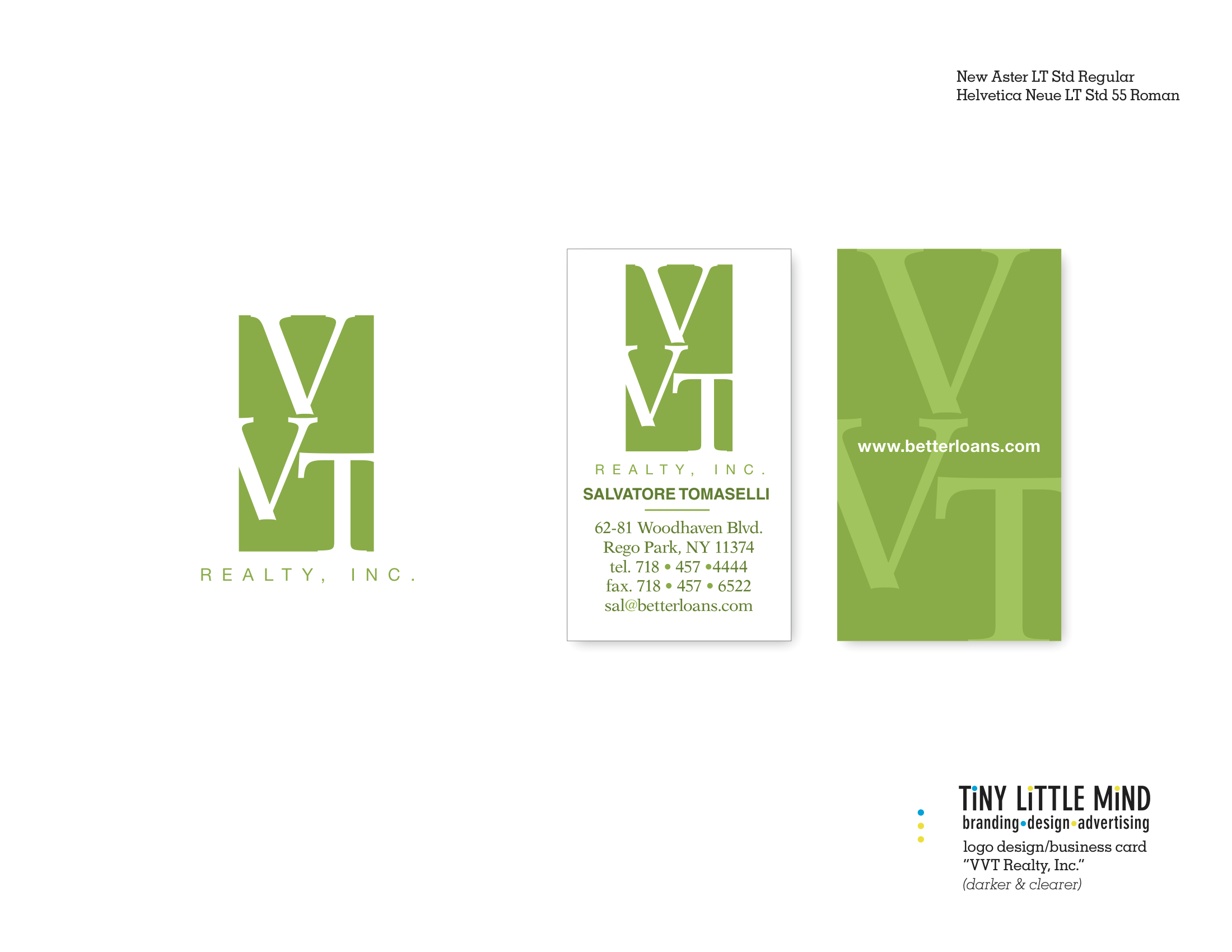
Eventually I’m going to run out of real estate puns… or whatever you’d call these truly awful headlines. I was contracted to create a new brand (logo and business card) for a pre-existing client who was considering branching out into the real estate market. We were looking to create a look that said “high-end” condos and co-ops for the up and coming sections of Western Brooklyn & Queens. The venture is still being developed, but the logo and card have been solidified. And here they are:
Being hired to update a logo concept is an interesting exercise. It isn’t purely creative but a challenge in creating a variation that (one) doesn’t forget the “feel” and (two) respects the original design. I was handed the hand-drawn version which I felt had a very personal feel to it… kind of street and also welcoming to a curious customer. Trying to keep this in mind, this is the final result.
![]()
I own an entire closet full of tools, from basic hammers and screwdrivers, to drills and circular saws. In theory I should be able to create just about any wooden object my family or I would ever need. Why, then, do I buy all my furniture from manufacturers who make these things professionally? Because I am not a carpenter. If someone came to my home and saw a table that I had built, it would be blindingly obvious. Said table would be structurally unsound and horribly finished. I don’t know enough about making a table, nor about what it takes to make it well. It would be an amateur job. You wouldn’t want it in your home, and neither would I.
A person can purchase the same applications designers used to create professional designs, but that does not make them a designer. Designers aren’t people who merely know the programs available for design. They are not trained monkeys who exist solely to push the correct buttons. Designers are professional aesthetes for hire… people who understand not only the “hows” of design, but the “what works” and “whys”. They have an innate ability to create – to merge word, space, and image in a way that compels.
If I tried to make a table, it would be have four legs and a top… and it MIGHT stand on its own. It wouldn’t be something people would admire, or to trust to do its job properly.
My dinner deserves more that that… and so does your business.
I was recently invited to be a guest blogger by BitTorrent to talk about their Sync application/service. And here’s the link:
The most important part of hiring an outside contractor is communication. And perhaps the most important information that needs to be shared through this communciation is this:
When do you need it by?
It is at best silly (there’s no way for the contractor to plan his or her work flow – see this previous post) and at worst arrogant (assuming the contractor can just drop everything else to get to your job) to keep a deadline a secret. If you don’t know it that’s just fine, but be aware that if the contractor has a job that he or she HAS a deadline for, that project takes priority.
Always.
So if you want your job done in a timely and unrushed fashion, share your timeline with your contractor. It will reduce conflict and make for happier client-contractor relations.
