Jason Polkovitz
Graphic Design & Art Direction
Category: Our work
-

MoMath has an upcoming games night (mostly board games with mathematical credibility) and needed a logo for web and other promotional materials. The pivot point on the Q was a play on the name of the event, with the playing piece balancing out the design.
-

Unfortunately, neither of these designs were picked by the client as he wished to go in more of a hand-drawn, Etsy-style direction (which was executed in a subsequent iteration). At any rate, I was fairly pleased with both concepts.
-
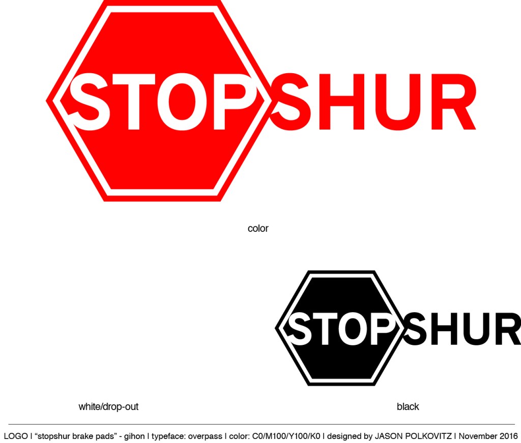
I was recently hired to create a brand name, logo, and packaging for a brake pad manufacturer who wanted to start selling their product in the United States. Below I’ve included the logo concepts, final logo, and package design. As a side note (to explain a geometrical anomaly): the traditional octagon was replaced with a…
-

Every week, the president of the National Museum of Mathematics creates two puzzles that appear in both The Wall Street Journal and the website varsity.momath.org. The task here was to create a logo for these puzzles for their title: Varsity Math. The number to the bottom right of the logo indicates which week the puzzles…
-

The designs below were created for an exhibit at the National Museum of Mathematics called “Robot Swarm,” which explores the algorithms that describe the swarming behavior of animals such as birds and insect. A video and article appearing on The Verge regarding the exhibit appears here. These were concept designs for the logo. I’d originally…
-

Eventually I’m going to run out of real estate puns… or whatever you’d call these truly awful headlines. I was contracted to create a new brand (logo and business card) for a pre-existing client who was considering branching out into the real estate market. We were looking to create a look that said “high-end” condos…
-
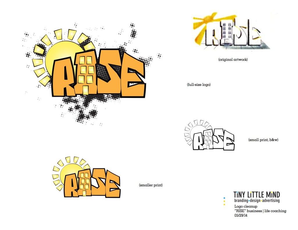
Being hired to update a logo concept is an interesting exercise. It isn’t purely creative but a challenge in creating a variation that (one) doesn’t forget the “feel” and (two) respects the original design. I was handed the hand-drawn version which I felt had a very personal feel to it… kind of street and also…
-

tiny little mind has recently been engaged by Clarke Realty to create new business cards and promotional material for their real estate sales efforts in New Rochelle and the surrounding area. When I went up to meet with the client I was blown away by the beauty of the place… even in the dead of…
-
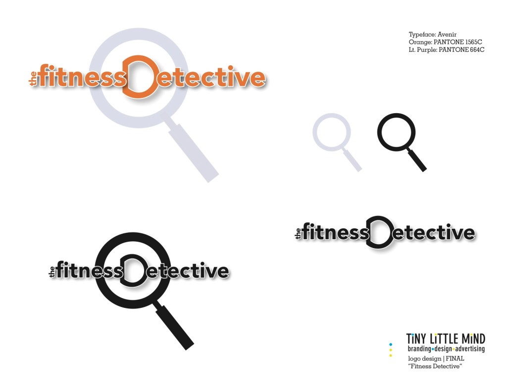
Jannette La Sota is a personal trainer and fitness coach in Queens, New York, who decided the time had come for a fresh new brand for her business. She contacted tiny little mind and after a meeting to learn as much about her business, clientele, target audience, and hopes for the future of her endeavor,…
-

A few weeks ago, the Forest Hills Chamber of Commerce had one of their biannual Street Fairs on the main drag of Austin Street in Queens, NY. Our client, Gotham West Realty, had a strong presence there with an eye-catching booth. We’re happy to say that they attracted some nice business that day. Could it…
