USAMTS logo redesign
As part of consulting on the redesign of the Art of Problem Solving’s USA Mathematical Talent Search website, I embarked on a redesign of their logo. The first three designs are completely original and the fourth is a redesign of the existing logo, substituting the serif typeface for a sans-serif one to create a more…
Keep readingWayfinding
I designed a set of wayfinding signage concepts for MoMath’s new facility at 19th Street and Sixth Avenue. Although the space ultimately opened without using these designs, the project was an engaging exploration of spatial communication, and I’ve included the work here as part of my portfolio.
Keep readingA Composite of math and art
Over the years I was graphic designer at the National Museum of Mathematics one of the recurring projects I worked on was the creation of promotional and informational graphics of for the museum’s art gallery: Composite. Below are a handful of the promotional sign graphics from a select group of shows.
Keep readingFit to a T
For years, I’ve been contracted by The Art of Problem Solving to create the t-shirt designs that the participants of a mathematical competition receive. It’s a fun creative exercise to do something different with each successive year. The illustrations in the 2025 t-shirt were created by my brother, Cary Polkovitz.
Keep readingUnlimited
A logo design for the National Museum of Mathematics’ junior high and high school social evenings.
Keep reading
You can keep your hat on
In 2023 a new tessellating tile was discovered that opened the door to several others that disproved long-standing geometry theories about tiling patterns. “The Hat” was the first of at least three new tiles that created aperiodic patterns (non-repeating). In celebration of this, MoMath and the UK Maths Trust ran a celebration and contest to…
Keep reading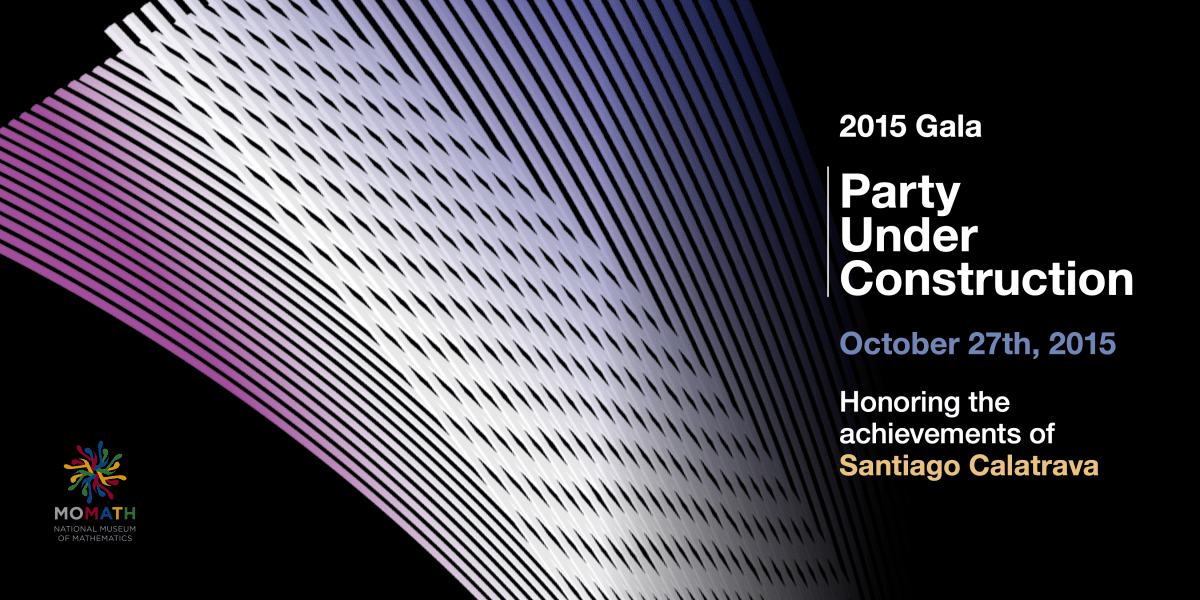
2015 Gala
One of my duties as Graphic Designer for the National Museum of Mathematics in New York is to create graphics for the annual gala. This was one from 2015 honoring Santiago Calatrava, whose Occulus building down in the Financial District had just been completed. The design was informed by his style and the Occulus specifically.
Keep reading
Making math fun for the littles
The National Museum of Mathematics (MoMath) went online-only during the COVID19 pandemic of 2020. In order to continue the mission of education – in this case specifically for very young children – the educators employed by the MoMath created lessons to be taught via ZOOM. These are some of the illustrations that were created to…
Keep reading
Just keeping my hand in.
As an on-staff graphic designer (or, rather, THE on-staff graphic designer) of a museum, the repetitive nature of the work can start to grind you down. I had seen a job offer online and decided to mess with the concept, even though I wasn’t going to get the freelance gig… you know, to keep those…
Keep reading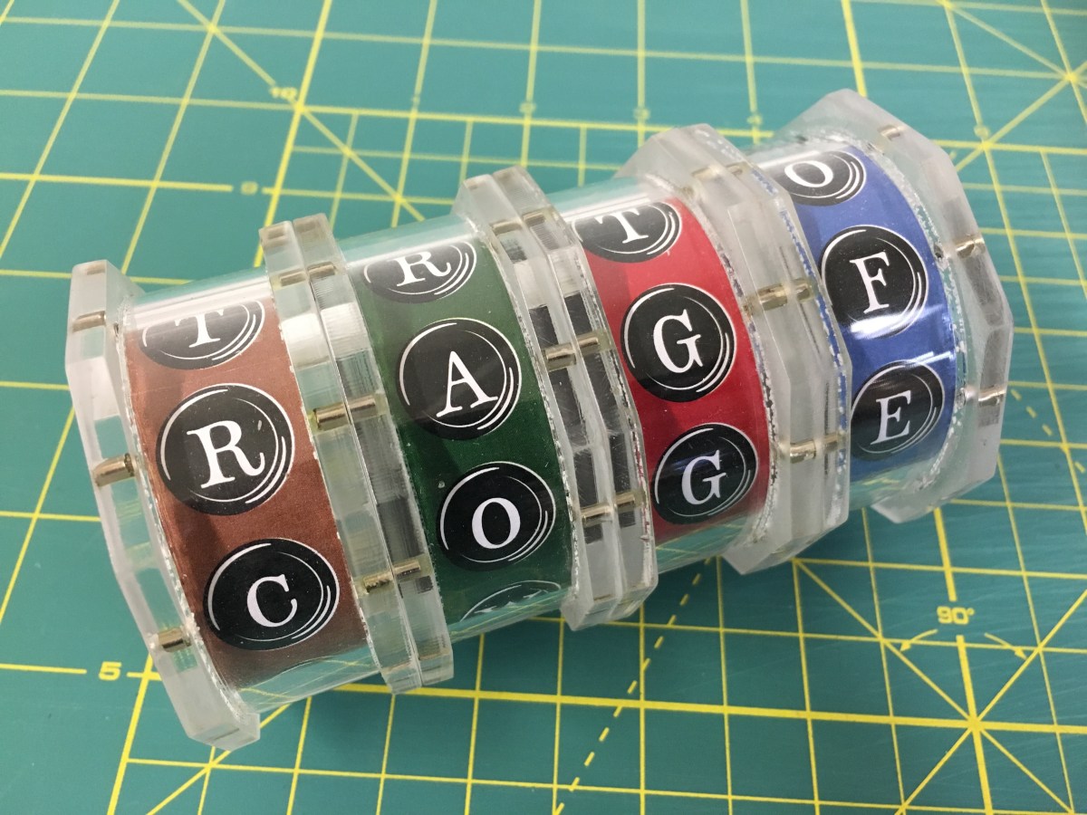
An enigmatic puzzle
A few years back, on the heels of the release of The Imitation Game , MoMath hosted a puzzle hunt based on that film. To that end, the exhibit designer and I were tasked to create a codex cylinder for one of the problems the participants were to solve. He created this lovely acrylic and magnet…
Keep reading
A debate on math education
The Museum hosted a debate around a year ago highlighting the pros and cons regarding the current state of high school level mathematical education in the United States. I was asked to create a backdrop (which also acted as an advertisement on the Museum website).
Keep reading
An unfinished restoration
Unfortunately this project – a promotional brochure for a furniture restorer – died in the making… which is a real shame. I loved how it was coming along, and I respected the heck out of Marco and his amazing craftsmanship. The shop in Queens was a wonderland of tools and in-progress work. Marco is still…
Keep readingA little one-on-bot half court
MoMath opened a new exhibit this morning – the idea of which is to enter the parameters of a basketball shot into a ball-throwing robot and allows you to try your hand at trying to replicate the shot yourself at a basket placed next to the bot’s. A computer analyses both shots – allowing you…
Keep reading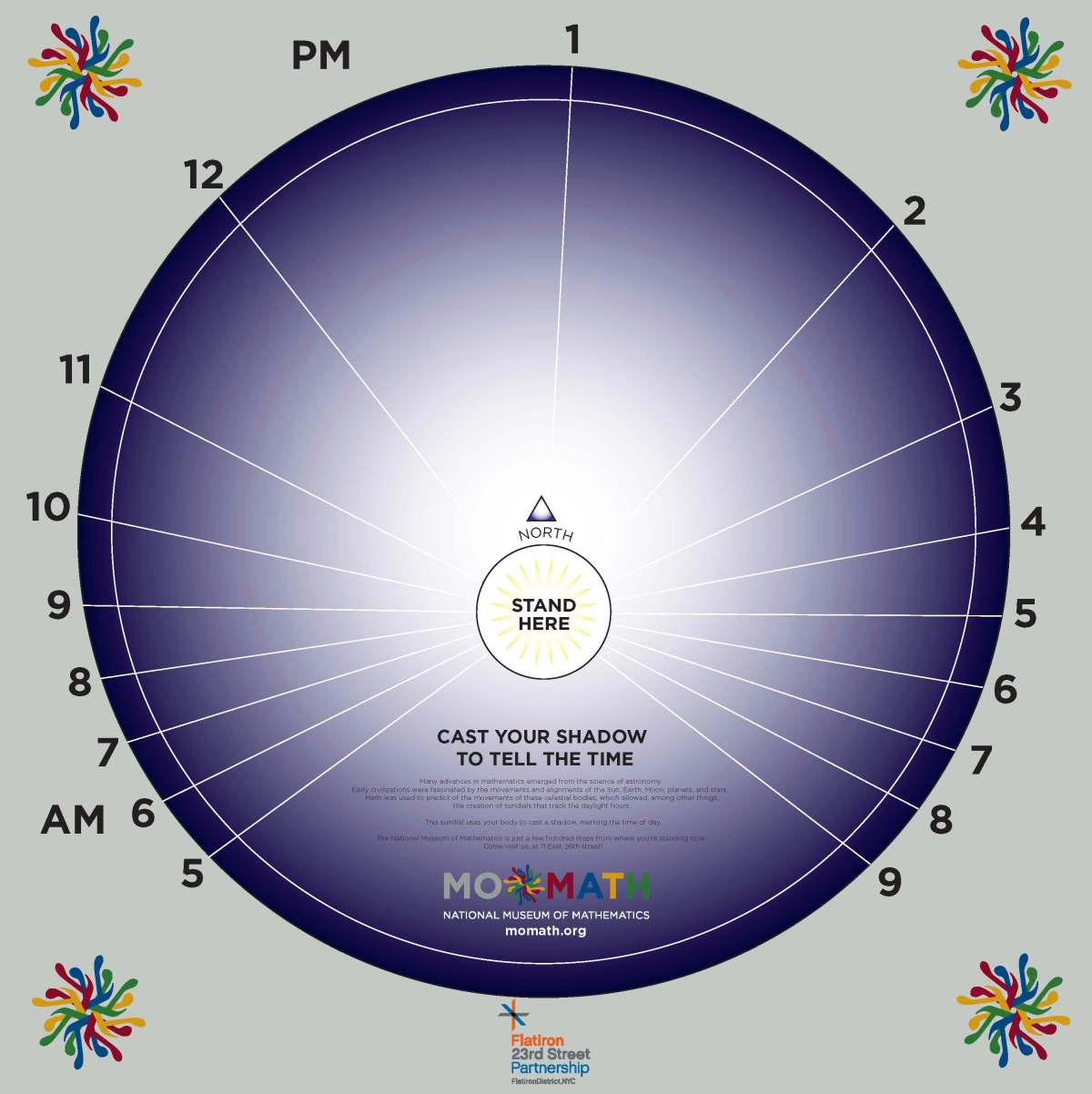
Summer in the city
MoMath likes to celebrate the solstices with math-related events in the plaza just north of the Flatiron Building. This year I was tasked with designing a sundial (along with our Chief Educator and Associate Director as technical consultants) wherein a person would stand as the gnomon and cast a shadow telling the time of day.…
Keep reading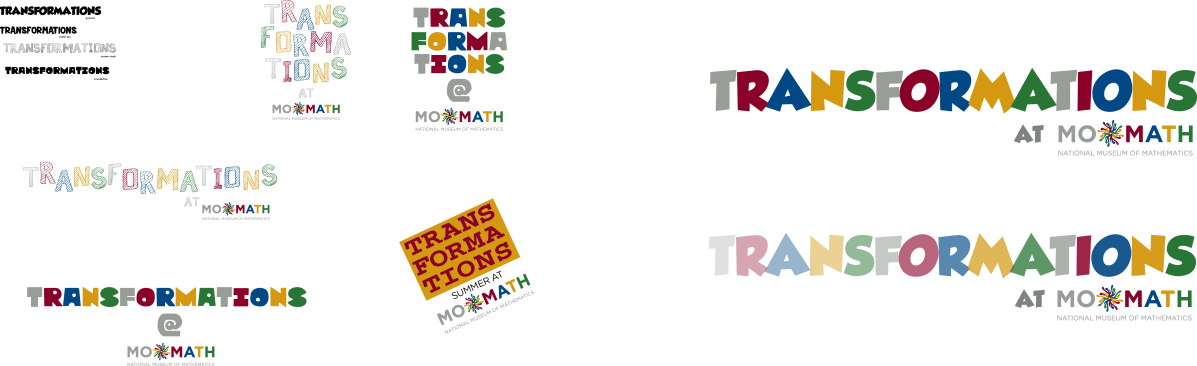
Summertime, and the learnin’ is easy.
Summer is coming and with it the salvation of all parents who work full-time: summer camp. I was tasked with coming up with the logo for the summer program of the Museum to appear in promotional materials as well as the t-shirts the kids will get. (The final design can be found is on the…
Keep readingThe math festival this city deserves
The directive was to come up with a logo for what is hoped to become an annual mathematics festival for New York City. In the end, the Museum decided to go for a more generic look for the promotional material, but I was quite pleased with how these were turning out so I decided to…
Keep readingDesktop wallpapers
Here are a few desktop wallpapers I made when I got my fourth computer. I figured I’d make them free to use for anyone who enjoys the numeral “4”. If you like and use them, please comment or drop me a line via the “email” link to the right of the page. Thanks!
Keep readingOn art, ego, and appropriation
(I commented on a post by a friend on Facebook and felt a need to share – and expand upon – it here): Art isn’t about the artist. It is about how the piece affects the people who view it. If an artist doesn’t like another artist that is irrelevant to the work – and…
Keep readingWould you like to play a game?
MoMath has an upcoming games night (mostly board games with mathematical credibility) and needed a logo for web and other promotional materials. The pivot point on the Q was a play on the name of the event, with the playing piece balancing out the design.
Keep readingThe key to your happiness, a door to your future: a real estate company re-brand.
Unfortunately, neither of these designs were picked by the client as he wished to go in more of a hand-drawn, Etsy-style direction (which was executed in a subsequent iteration). At any rate, I was fairly pleased with both concepts.
Keep readingStop
I was recently hired to create a brand name, logo, and packaging for a brake pad manufacturer who wanted to start selling their product in the United States. Below I’ve included the logo concepts, final logo, and package design. As a side note (to explain a geometrical anomaly): the traditional octagon was replaced with a…
Keep reading
Go (math) team, go!
Every week, the president of the National Museum of Mathematics creates two puzzles that appear in both The Wall Street Journal and the website varsity.momath.org. The task here was to create a logo for these puzzles for their title: Varsity Math. The number to the bottom right of the logo indicates which week the puzzles…
Keep reading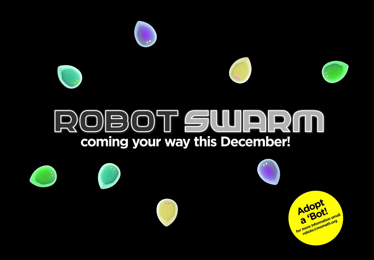
Swarms of Robots
The designs below were created for an exhibit at the National Museum of Mathematics called “Robot Swarm,” which explores the algorithms that describe the swarming behavior of animals such as birds and insect. A video and article appearing on The Verge regarding the exhibit appears here. These were concept designs for the logo. I’d originally…
Keep readingWhy I like the new Google logo
I’m kind of glad that the New Yorker published this article lambasting the new Google logo as it helped to solidify my opinion on it. I happen to like the new logo. It does what it needs to do from a design perspective. I don’t mean aesthetic, I mean design. It needed to be clean…
Keep reading
It’s getting real (estate) in here.
Eventually I’m going to run out of real estate puns… or whatever you’d call these truly awful headlines. I was contracted to create a new brand (logo and business card) for a pre-existing client who was considering branching out into the real estate market. We were looking to create a look that said “high-end” condos…
Keep readingRising to the occasion
Being hired to update a logo concept is an interesting exercise. It isn’t purely creative but a challenge in creating a variation that (one) doesn’t forget the “feel” and (two) respects the original design. I was handed the hand-drawn version which I felt had a very personal feel to it… kind of street and also…
Keep readingWhy hire a professional designer?
I own an entire closet full of tools, from basic hammers and screwdrivers, to drills and circular saws. In theory I should be able to create just about any wooden object my family or I would ever need. Why, then, do I buy all my furniture from manufacturers who make these things professionally? Because I…
Keep readingAbout one of my favorite workflow services.
I was recently invited to be a guest blogger by BitTorrent to talk about their Sync application/service. And here’s the link: http://blog.bittorrent.com/2014/04/15/sync-hacks-how-i-use-bittorrent-to-sync-my-office-and-mobile-workflow/
Keep readingDon’t keep it a secret… (or, an addendum)
The most important part of hiring an outside contractor is communication. And perhaps the most important information that needs to be shared through this communciation is this: When do you need it by? It is at best silly (there’s no way for the contractor to plan his or her work flow – see this previous post)…
Keep reading
Down(real-e)state New York
tiny little mind has recently been engaged by Clarke Realty to create new business cards and promotional material for their real estate sales efforts in New Rochelle and the surrounding area. When I went up to meet with the client I was blown away by the beauty of the place… even in the dead of…
Keep readingDon’t fear the deadline.
As with just about everyone growing up, I feared deadlines. They felt like a great wall looming in the mist – something that would race up and slam into me. They crippled my creativity by lacing it with dread. I had yet to understand the great gift that a deadline gives a creative endeavor. By setting…
Keep readingSame sh*t, different day… beware of overdoing it on social media.
These days I find there are times that I simply don’t want to open my Twitter or Google+ accounts. I follow a few marketing people on both of these services and though there are some who are wonderful and incisive in their observations and choice of post-sharing, others are repetitive in their posts and self-serving…
Keep readingWhy you (don’t really) hate advertising.
You hear this a lot: “I hate advertising.” Most of the time that opinion is based on either display (transit/billboard/etc) advertising or, even more often, online advertising. The thing is, you don’t really hate advertising. You just hate how it is done. Before I get into that can of worms and how ads can be…
Keep reading
Design and ego.
Design is not a competition. It is not about ego. It is about doing the best job possible for your client. If winning a competition helps the client (or helps you keep your client) that’s fine… but it should never be the primary goal of the work. I’ve both judged and won competitions, and, although…
Keep readingThe right “fit” for a logo…
Jannette La Sota is a personal trainer and fitness coach in Queens, New York, who decided the time had come for a fresh new brand for her business. She contacted tiny little mind and after a meeting to learn as much about her business, clientele, target audience, and hopes for the future of her endeavor,…
Keep reading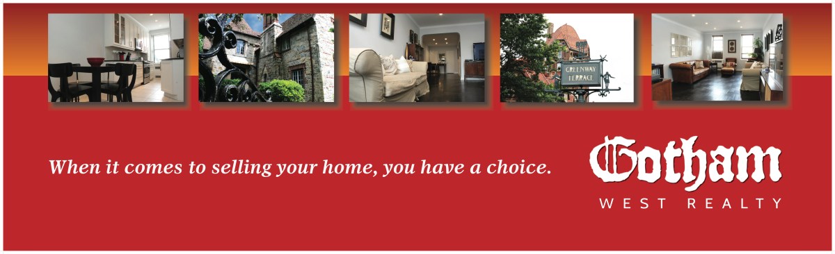
All’s (street) fair…
A few weeks ago, the Forest Hills Chamber of Commerce had one of their biannual Street Fairs on the main drag of Austin Street in Queens, NY. Our client, Gotham West Realty, had a strong presence there with an eye-catching booth. We’re happy to say that they attracted some nice business that day. Could it…
Keep reading
I can see clearly now…
MK Vision Center, a terrific purveyor of glasses in the area of Queens where I live, was kind enough to be a booster/sponsor for my son’s school. As a thank you, I created a web ad targeting parents that appears on the website of the Parent Association stressing their children’s related eyewear and optometric services.
Keep reading
Real estate, my boy. Real estate.
tiny little mind was contracted by Gotham West Realty to design a direct mail campaign showing that, by using marketing techniques such as interesting photography and custom sales copy, sellers would have more tools with which to move their homes. Below is an example of the postcards created to entice sellers to work with Gotham…
Keep readingOn borrowed interest
Borrowed interest adds nothing but confusion to marketing. If something doesn’t relate to your product, service, or company image, it doesn’t belong. Borrowed interest belittles your product by showing that you have nothing to make yours the best of the lot and insults your true target audience by promoting fluff over substance.
Keep readingBranding vs Marketing
This morning I read a point/counter-point style article that came my way via Twitter (thanks to @boxofnuts22) talking about the difference between branding and marketing. Here’s the gist of it: The first person’s explanation was long and winding, full of MBA-style doublespeak and overly complex sentences. Boiled down he says that branding is company reputation…
Keep reading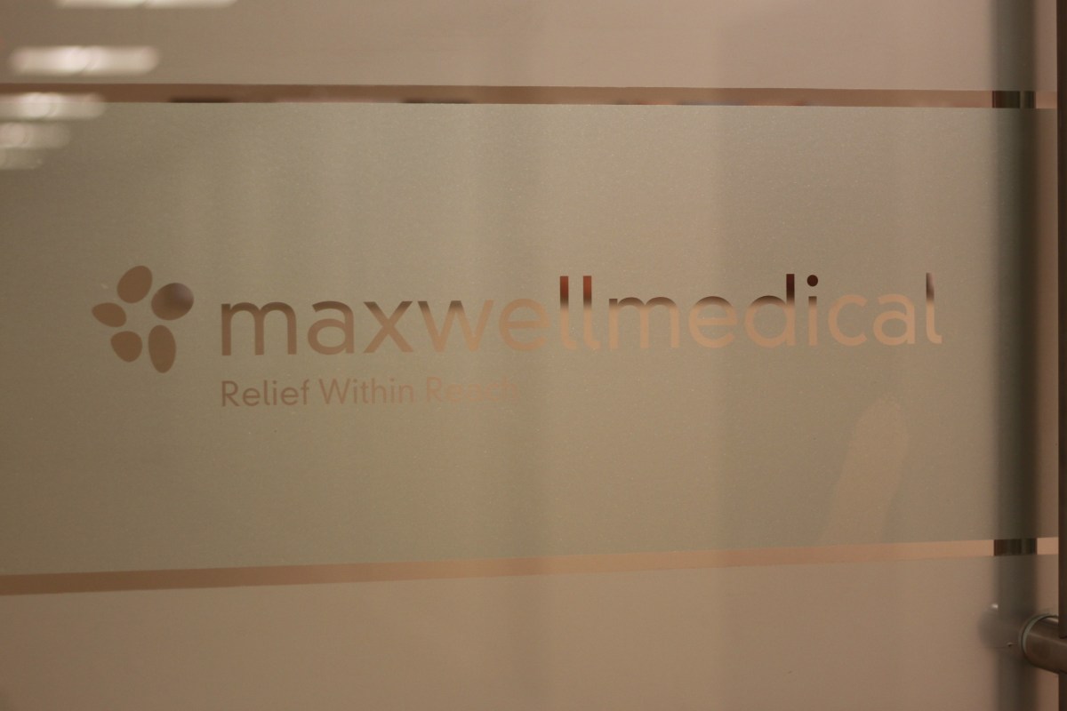
Opening doors on a healthier life.
MaxWell Medical wanted to give their front doors a classy look while still showing what they do (and make it easier for clients coming off the elevator to tell what door they were supposed to enter). The other requirement was to maintain privacy for the clientele and office staff. Here’s what we came up with.
Keep readingContext in design.
Context is key. You get a lot of people who feel that Helvetica makes everything better and Comic Sans is the typeface of the devil. Here are two designs that follow different philosophies… one based on flat design and Helvetica and one based on a more dimensional design and Comic Sans. I asked my two-year old…
Keep readingLet me tell you a story…
That’s what advertising is about. It is about telling a story. A story of boy has a problem, girl has the solution. Boy meets girl and she solves his problem. Substitute boy with your target audience and girl with your company and you have an ad. You are trying to convince your target audience that…
Keep readingThe path of a logo
The images below show the progression of ideas that go into a logo design. The final version was picked by the client in order to offset a possibly overly fanciful name. The design flow (starting with a later discarded “navigational/nautical” theme then moving into a final, “diamond” theme): The final design:
Keep reading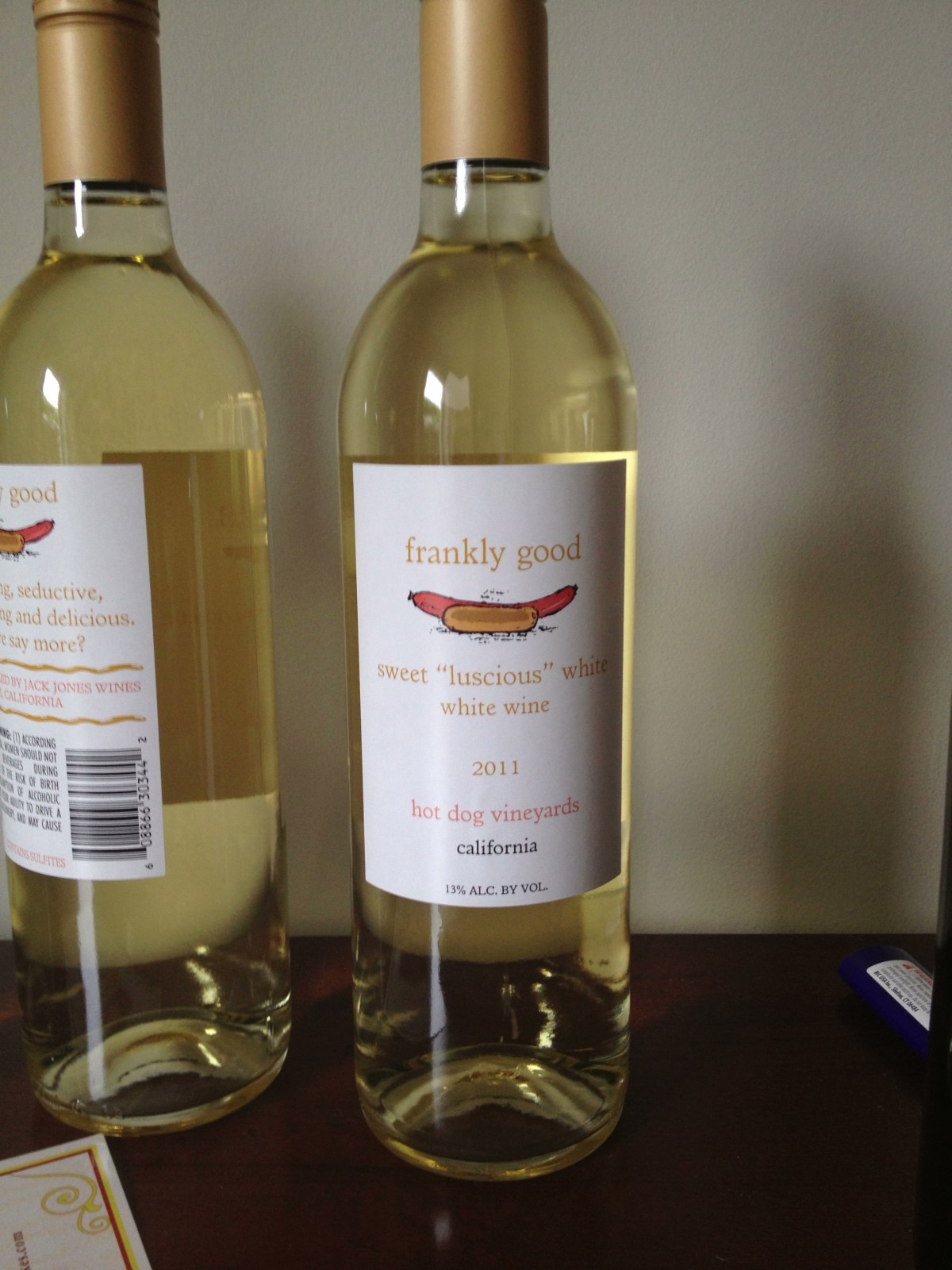
Frankly good
Continuing with our foray into the world of label design we encounter “Frankly Good” released by Hot Dog Vineyards through Jack Jones Wines. The idea was to be fun but simple – getting across the idea of a light, white wine that would be perfect for casual dining. A lot of the artwork on the…
Keep readingEmpathy and advertising.
By now I’m sure a lot of you will be aware of Hyundai’s ad promoting one of their low-emission vehicles. There’s this poor soul who, distressed with how life has dealt him a bad hand or something (I’m fuzzy on the details) decides to end it all by committing suicide by carbon monoxide poisoning in…
Keep readingHelvetica, the other white meat.
Let me start by saying I like Helvetica. A lot. It is a wonderful typeface with a plethora of uses, but (and here is where I’m going to get in trouble with typophiles everywhere) it is not the be-all-and-end-all of typefaces. It is not, as some would have you believe these days, the bacon of…
Keep readingStreamlining the process.
Outside of the obvious reasons a company should consider a branding plan – strong identity, a clear message, the possibility of the holy grail of brand loyalty – there is the added bonus of speed. With a well-crafted branding scheme in place, the designer and client hit the ground running on every project. There doesn’t…
Keep readingThe purpose of design (elements)
Last night I saw this on the Google+ Graphic Design community I belong to: “What do you consider to be good #graphicdesign elements?” Sigh. Here’s why this is a silly question. A good graphic design element is one that fulfills its intended purpose. Design doesn’t exist in a vacuum – and certainly design elements don’t. Its like…
Keep reading
All about the mustache and a great glass of wine.
The latest release from Jack Jones Wines. Mustache Vineyards 2011 Pinot Noir. Mustache is branded to be a fun, easily accessible wine that takes taste, although not itself, seriously. The vineyard’s slogan is “its all about the mustache and a great glass of wine.” This is the first of the Mustache Vineyards wines and we…
Keep readingThe customer is always right, but is the client?
They say the customer is always right. Does this hold true for the client? Not always. When it comes to branding and design, oftentimes it is important to note that the client will forget the point of the exercise that is marketing. Regardless of the inherent aesthetic taste of the client, it is his or…
Keep readingThe myth of the agile company…
I’ve been noticing a trend. There’s this thought in many companies that staying agile in their marketing affords them the flexibility to react to the market in which they do business. Unless the company in question serves an incredibly flighty market (of which I can think of… virtually none), this is the last thing they…
Keep reading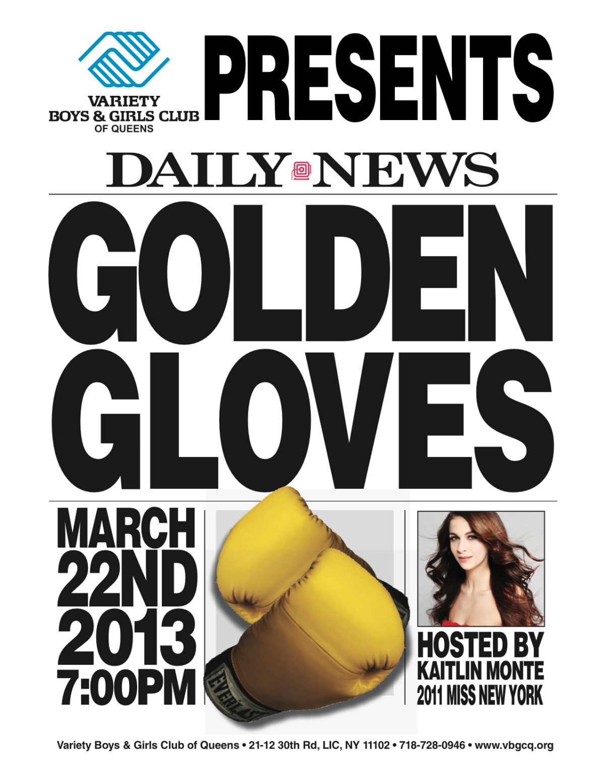
Fighting for a good cause
tiny little mind is honored to have been engaged by the Variety Boys & Girls Club of Queens to design material to promote their hosting of one of the Golden Gloves events. The Golden Gloves is an annual amateur boxing tournament sponsored by the Daily News. This event will help to promote the good works…
Keep reading
All up in his business (card).
I belong to a local business marketing group called BNI that works on the concept of giving business leads to others rather than concentrating on getting your own… which, of course, you do. Their motto is “givers gain,” which sort of explains the whole concept. Anyway, we’re encouraged to bring in new prospects at our weekly…
Keep reading
Putting a label on it
This is part of some work that I’ve not been able to write about until now. I’ve been designing wine labels for a couple of producers for the last year or so but the wine wasn’t released until recently. The client was looking for classy, yet showing a sense of humor for both the higher…
Keep readingOn austerity and advertising…
Hi, folks. Just a quick thought: In these hard financial times, there’s a tendency to cast about looking for ways to cut your company’s overhead. Certainly on a larger scale countries like Greece have been trying that with their austerity measures. We all see how that’s going. And that’s a problem. I’ve noticed that companies,…
Keep reading
Cures what ails you.
MaxWell Medical is a multi-location medical facility specializing in health maintenance through sports medicine, acupuncture, physical therapy, chiropractics and massage therapy. In order: a winter flyer (both sides), a water bottle label design for the summer opening of MaxWell’s new Wall Street location, and a wall sign design with location schematic.
Keep readingPerhaps an overstatement.
This is a small self-promotion piece to run as a business section sponsorship at the local Patch.com site. It simply states our philosophy that anyone and everyone is entitled to good design for their business – regardless of size or budget. It should begin running in April of 2011. It is an attempt to gain…
Keep reading
The family that creates laminar flow together…
SolarBee recently ran two ads that had a lot in common. The two people featured in these testimonials are a married couple who are the supervisors of two separate water facilities – Melinda Ward is the Superintendent of a wastewater treatment facility in Eden, North Carolina; and her husband, Michael, is the Director of Regulatory…
Keep readingPAX East 2011 follow up
PAX East was fantastic. Everyone from exhibitors to your average convention goer were wonderful. Considering the crowds (apparently tens of thousands a day!), it was impressive how polite and courteous everyone was. According to Steve (also Steve), Sacred Heart University’s representative there, the school’s booth received a lot of visitors who showed genuine interest. I’m…
Keep reading
PAX East 2011
Pictured above is the ad originally created for GamePro magazine and modified for the PAX East 2011 brochure. If you’ve come across this page by scanning a QR code worn by someone at that event – hello, welcome and thanks! Feel free to go to the Sacred Heart University booth and/or browse around my blog.…
Keep reading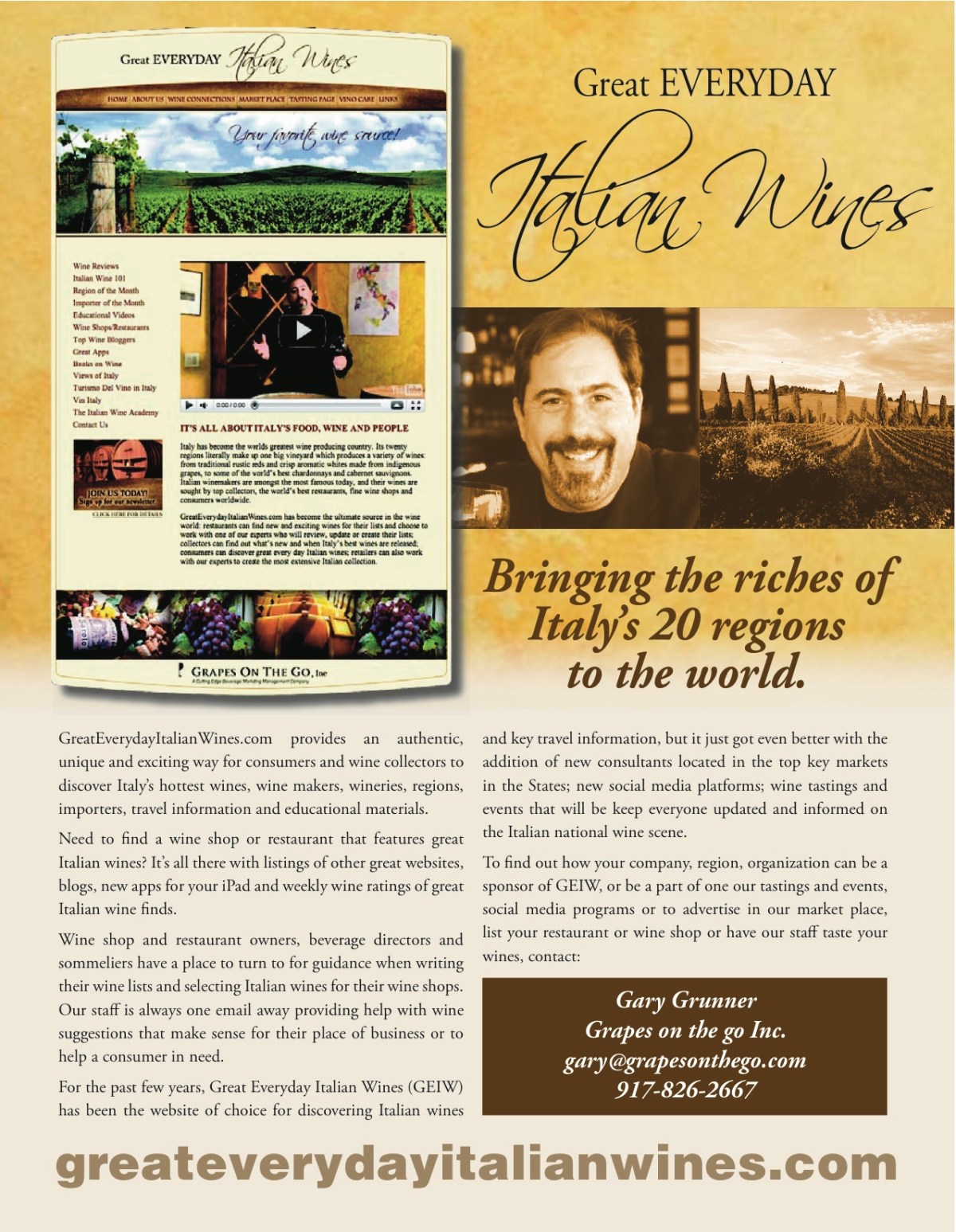
In Vino Veritas
Tiny Little Mind would like to welcome Grapes on the Go, Inc. to our client family. Grapes on the Go, Inc. is a beverage management consulting firm dedicated to building brands and categories, connecting Beverage producers to importers, brokers, distributors, PR firms and wine writers in the USA and oversee the day to day duties of…
Keep reading
More awards
This morning the Service Industry Advertising Awards (SIAA) announced the winners of their Eighth Annual Awards and two of the ads posted here did quite well. The following ad won the MERIT AWARD in the category of Magazine Ad, Single: And this ad won the GOLD AWARD in the category of Newspaper Ad, Insert: Needless…
Keep reading
A quick turnaround
Here’s an ad that was created fairly quickly. The assignment was handed to us last week and, due to business travel, we didn’t have a lot to work with until a few days ago. I’m really impressed with the efficiency that the client and copywriter showed in getting their respective materials to me. It wasn’t…
Keep readingOne more for the road.
And lastly (in this campaign), here is the two-sided four-color insert we ran in the Connecticut Post for the same graduate program information session. The front is a modification of the award winning “Picture yourself with a brighter future” insert and the rear is a total redesign to reflect a cleaner, less cluttered style than…
Keep reading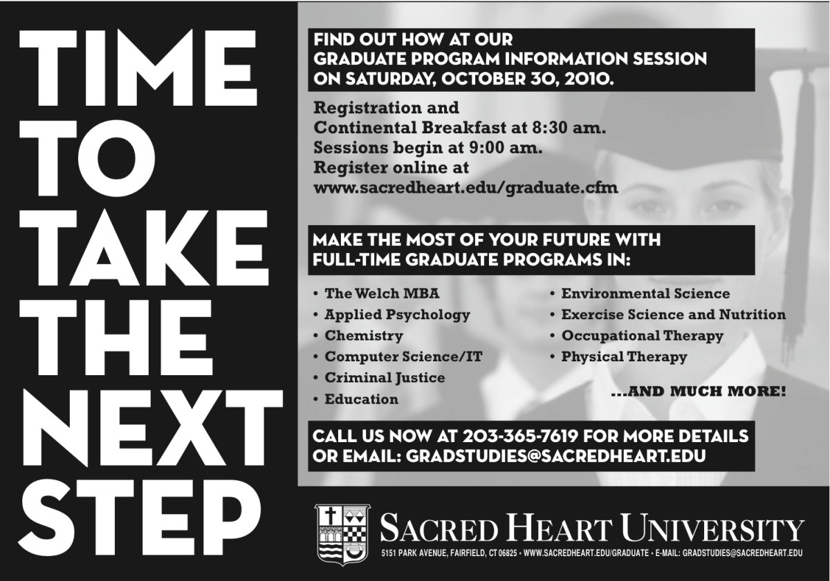
What’s Next?
Below is one in a series of ads that ran in 21 different college newspapers targeting undergraduate students who are thinking about pursuing a graduate degree before heading out into the professional world. This was a part of the campaign to get prospective students to a Graduate Information Session along with the movie theater spot…
Keep readingComing soon to a theater near you…
… assuming you live in Fairfield county, Connecticut. Here’s a 30 second spot that ran in October of 2010 to promote Sacred Heart University’s Graduate Program Information Session on October 30. It runs in conjunction with the rest of the campaign, which includes radio spots, newspaper ads and inserts, as well as small space ads…
Keep reading